
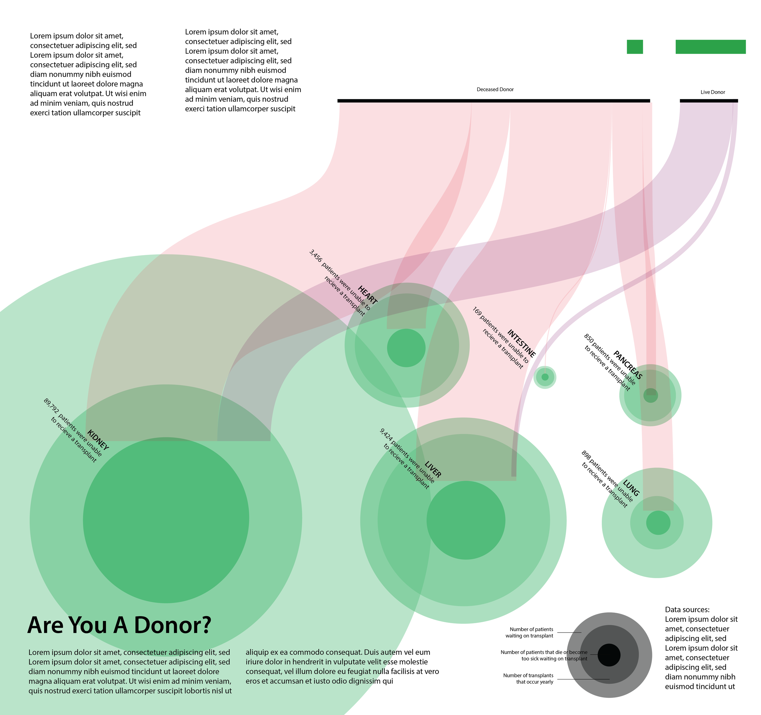
Data Visualization: Are You A Donor?Audience: General lay audience
Client: Professor Jodie Jenkinson
Format: Digital Infographic
Tools used: Adobe Illustrator, RawGraphs
Completed: April 2026
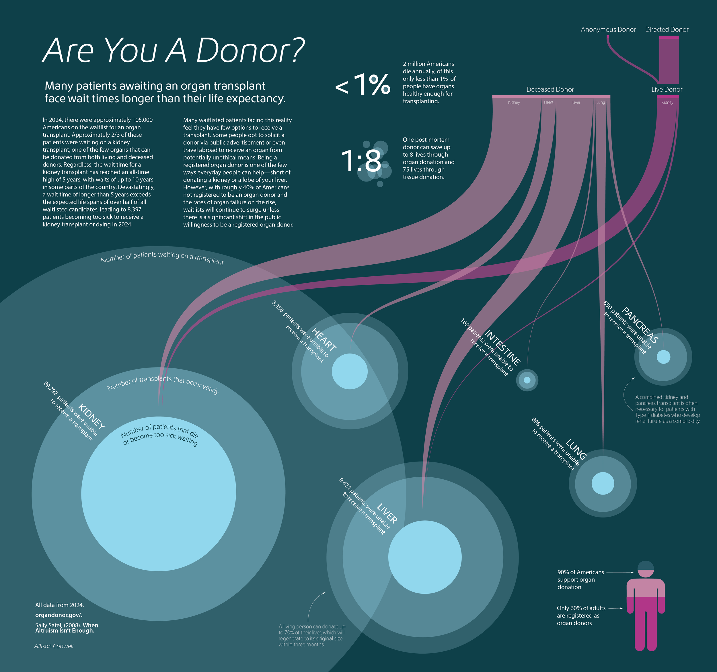
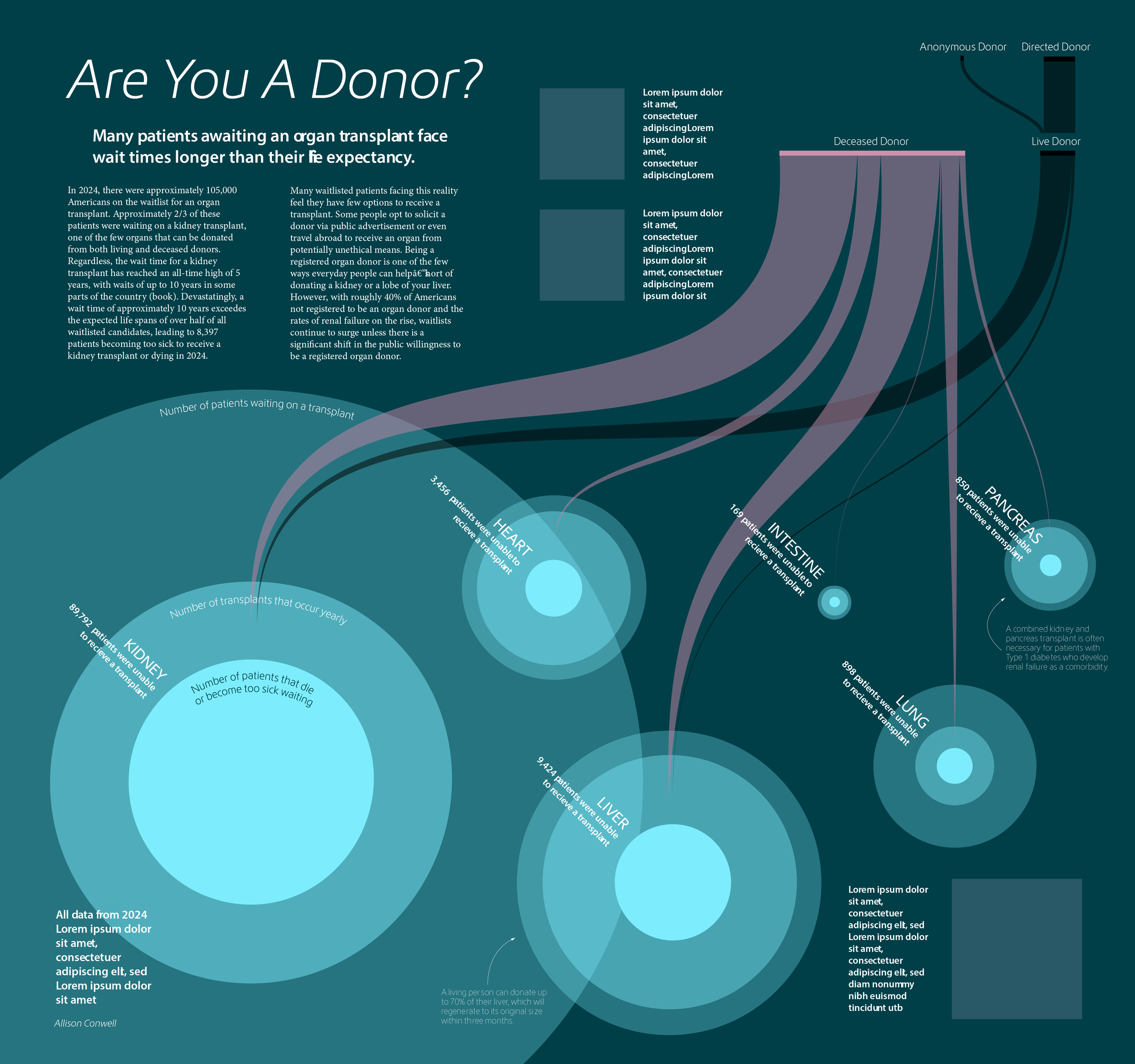
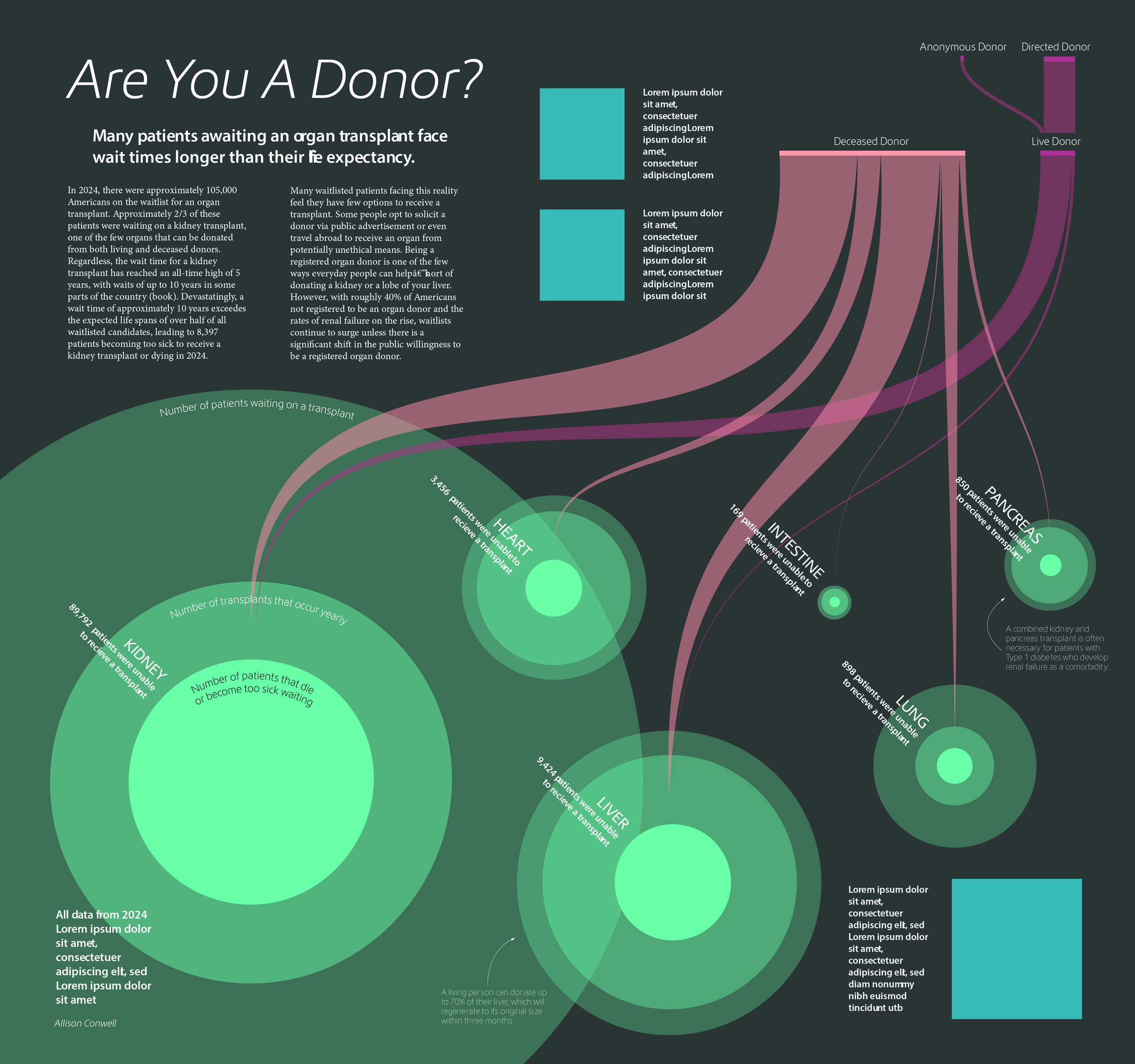
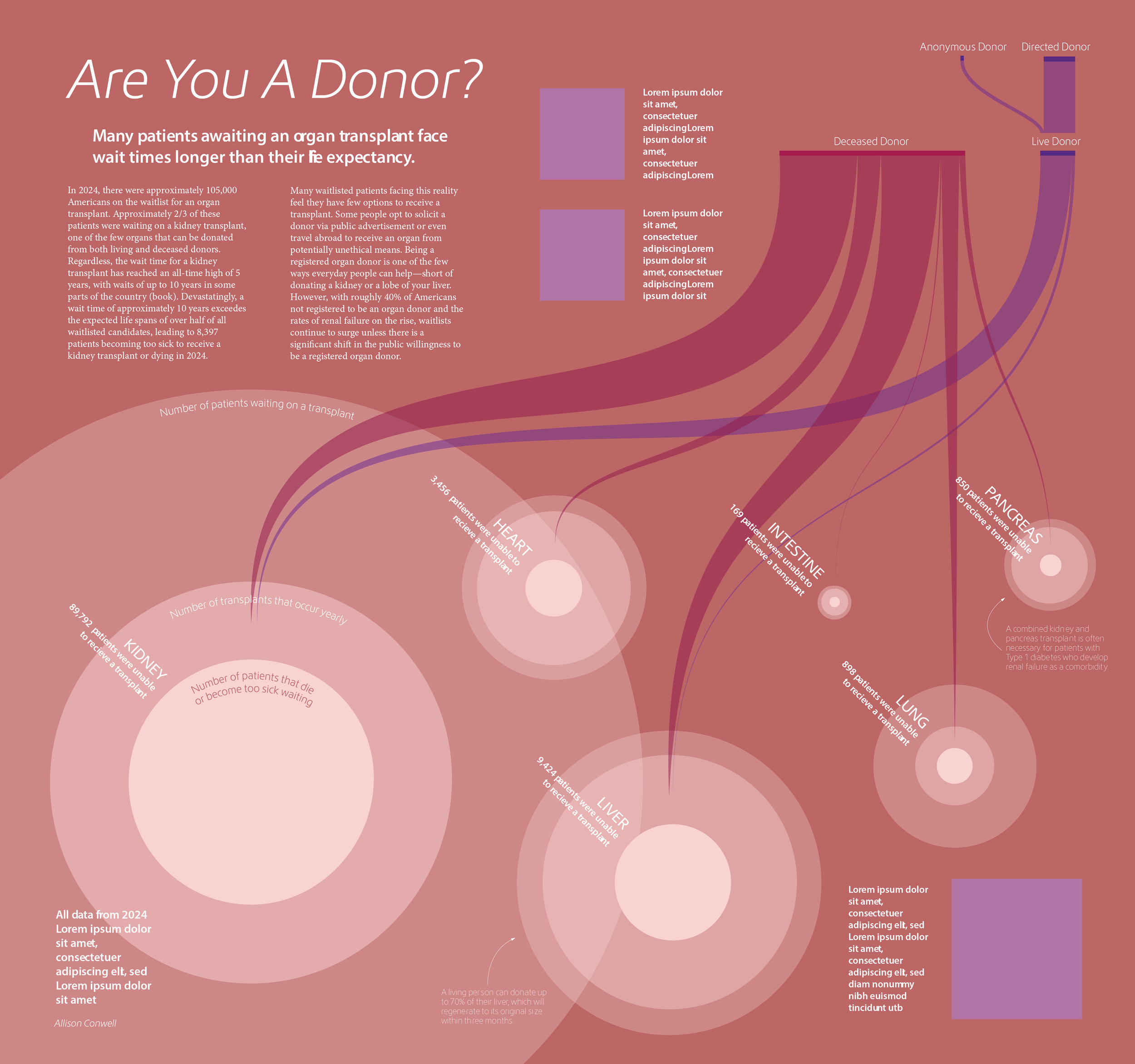
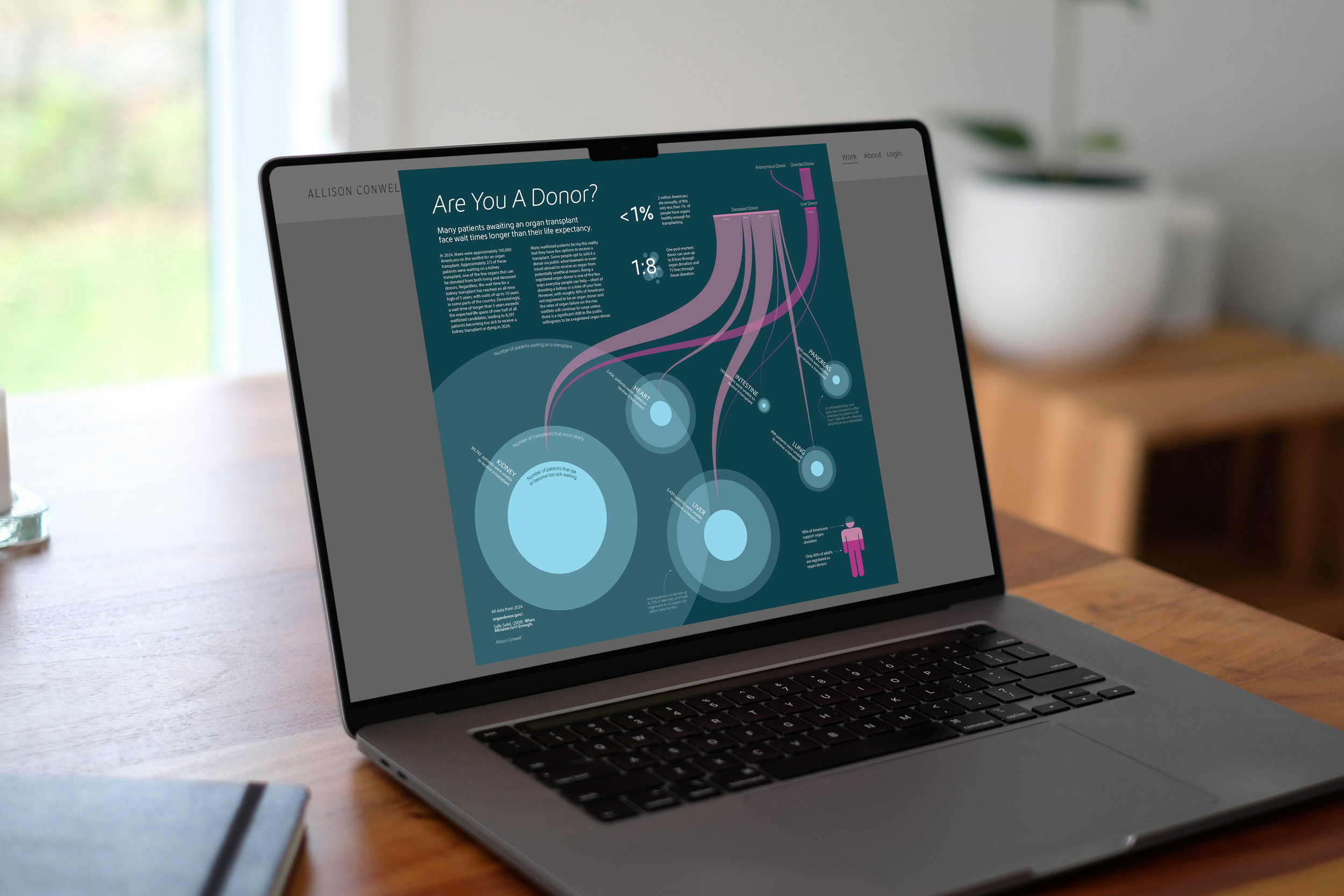
As a completion of the Information Visualization course within the MSc Biomedical Communications program, I created this infographic to visualize trends within organ transplantation. Specifically, comparing the number of people that are waiting on an organ transplant, that receive a transplant, and that become too sick waiting on a transplant with the rates of organ donation. This work aims to raise awareness about the ever-growing organ transplant waitlist and encourage the audience to learn more about the donation process.
1a. Database Research
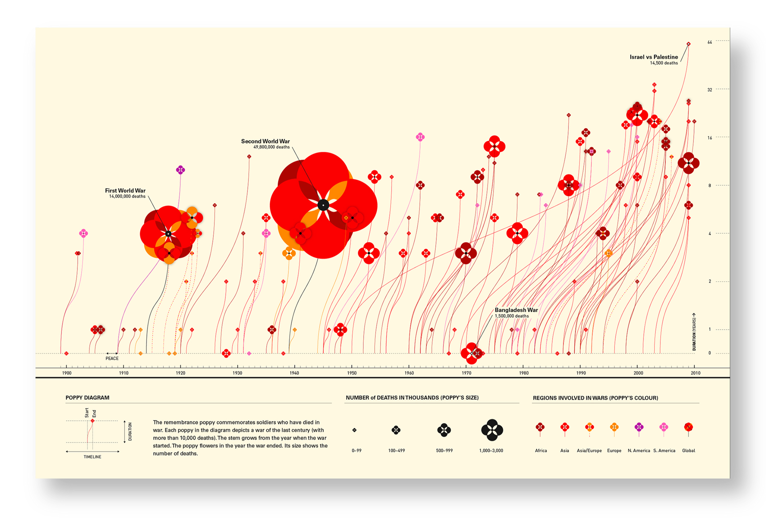
1b. Design Inspirations
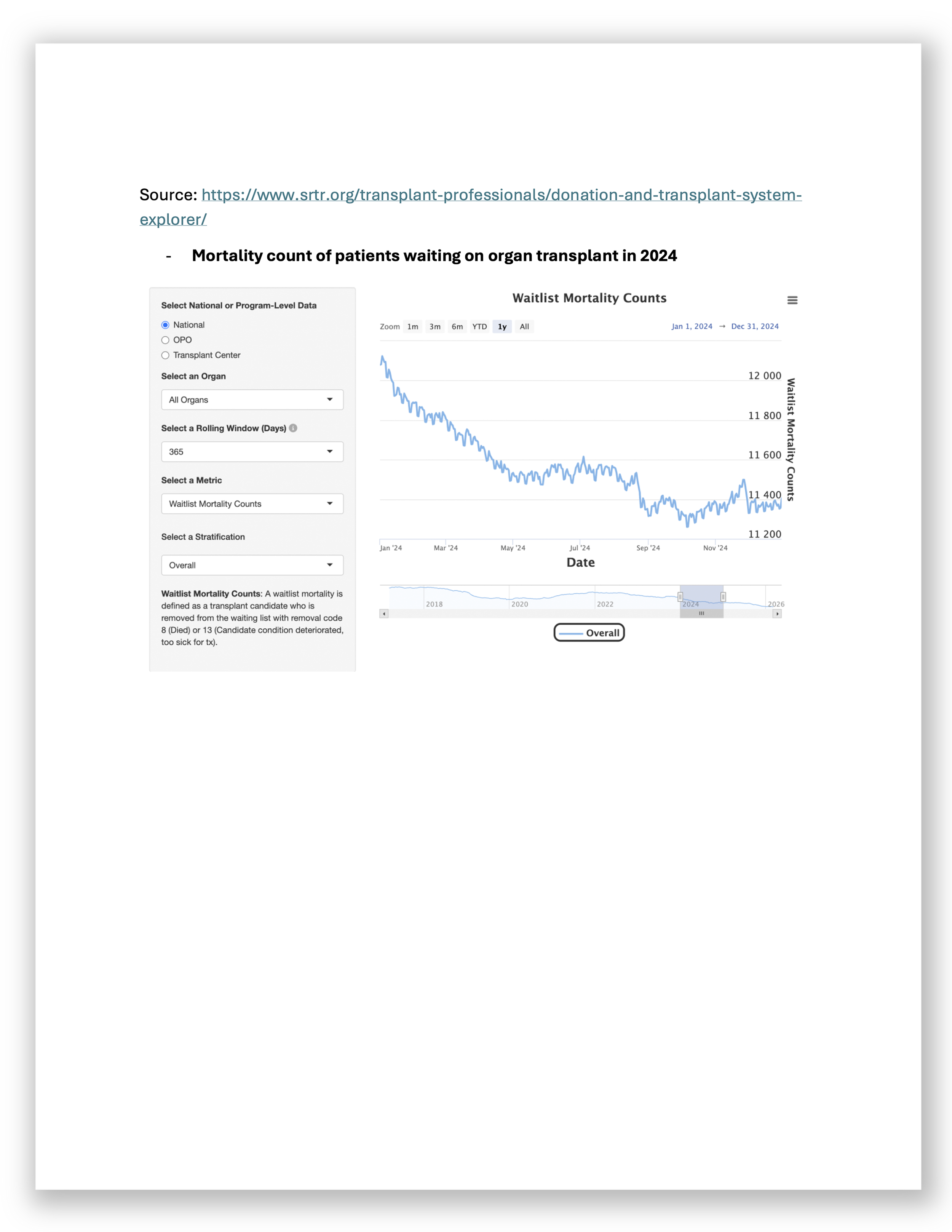
Initial research gave me insight into the trends of organ donation over multiple years. I first discovered disparities between the number of people waiting on an organ transplant and the number of transplants that occur yearly. In addition, I viewed the data through different chart types such as tables, bar, and line graphs. This gave me insight into which type of data visualization is best fit for the data. Specifically, I determined that using a bar chart where you could compare the size of two data points best facilitated my learning.
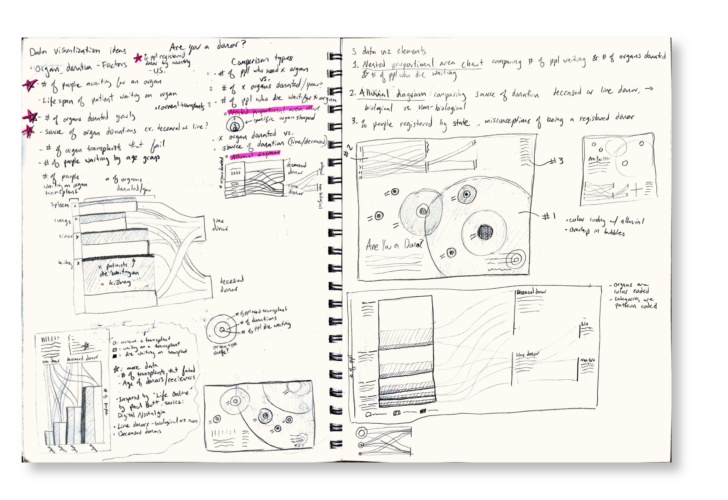
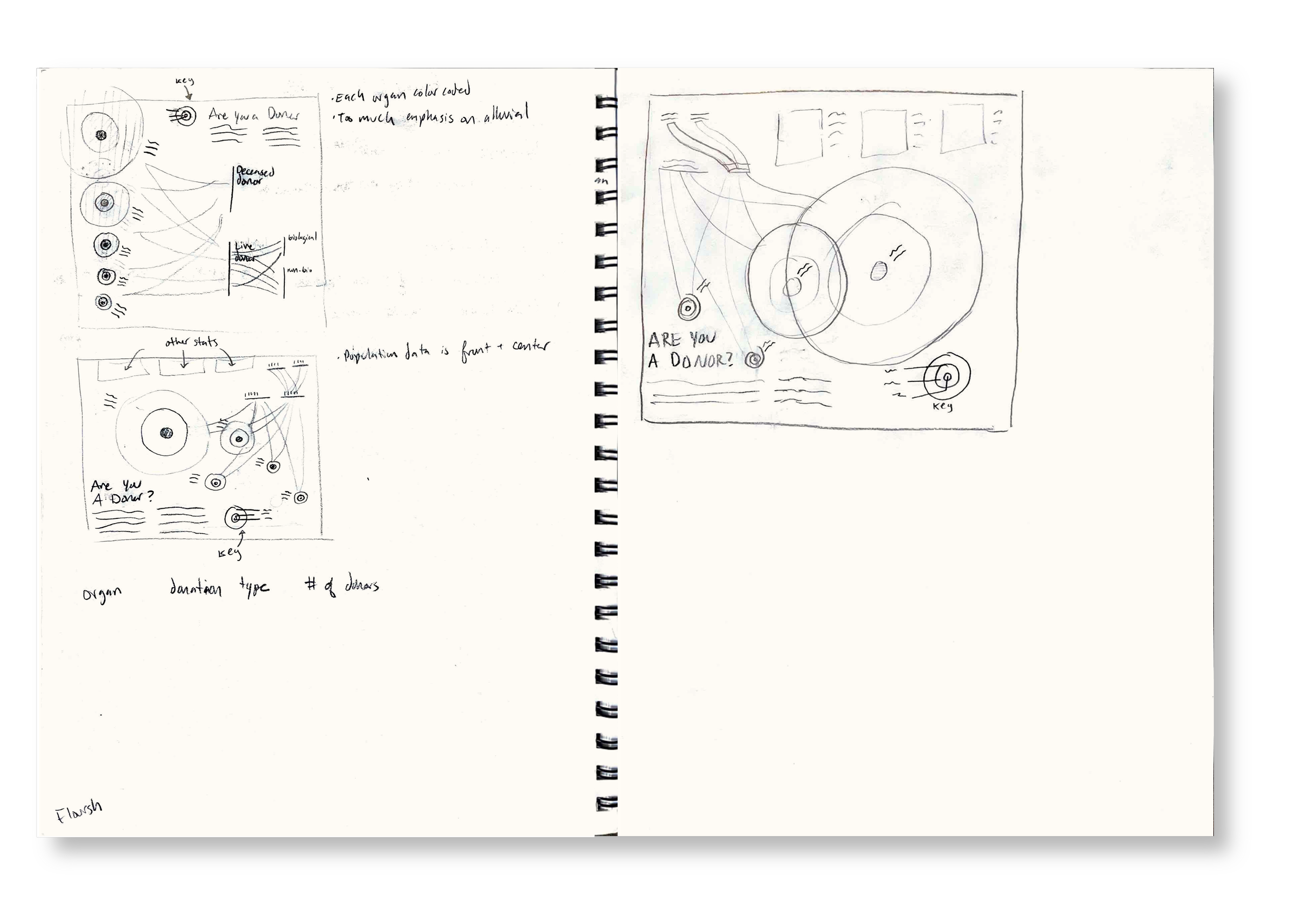
1c. Sketching
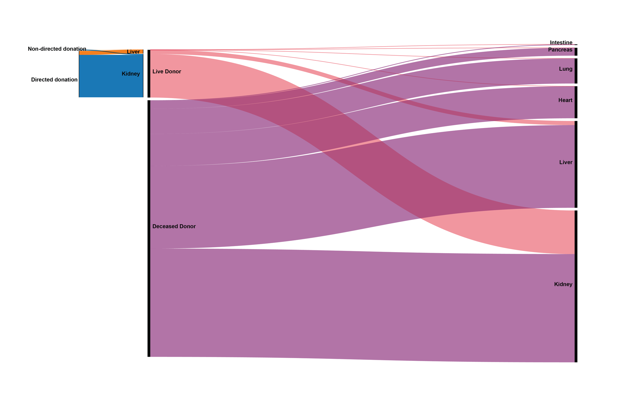
Sketching is a process that I maintain during all phases of research and production. I believe that I cannot put together a digital composition until I have established the elements and rough layout on paper. In these sketches, I considered my visual references as well as different chart types to visualize the data trends. I was especially intrigued by the combination of an alluvial graph with a nested proportional area chart.
2. Production


References
Next, I put together a rough layout of elements in Adobe Illustrator. For the rest of the production stage, I fine tuned labels, text, placement of elements, and added in secondary data callouts.
Once the design was mostly finalized, I used Adobe Color to generate different color iterations and applied my favorites to the design.
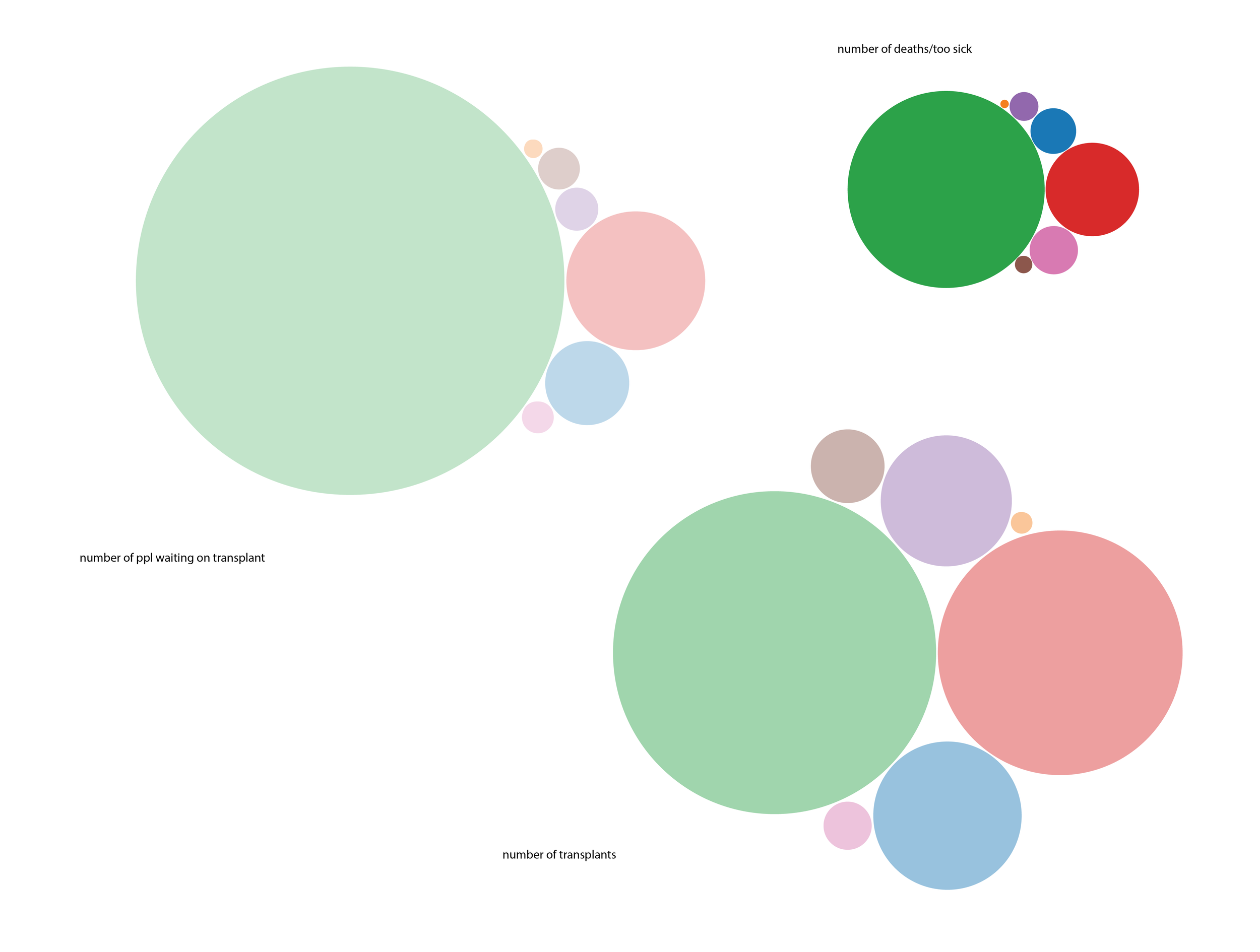
The first part of production was to create the graphical representations of data. First, I created data tables from the relevant raw data and used RawGraphs to develop area bubbles and alluvial graphs.


Canadian Institute for Health Information. (2025, June 5). Summary statistics on organ transplants, wait-lists and donors. https://www.cihi.ca/en/summary-statistics-on-organ-transplants-wait-lists-and-donors
Eye Bank Association of America. (n.d.). Statistical report. Restore Sight. https://restoresight.org/members/publications/statistical-report/
Health Resources and Services Administration. (2025, December). National data. U.S. Department of Health and Human Services. https://hrsa.unos.org/data/view-data-reports/national-data/
Health Resources and Services Administration. (n.d.). Organ donation. https://data.hrsa.gov/topics/health-systems/organ-donation
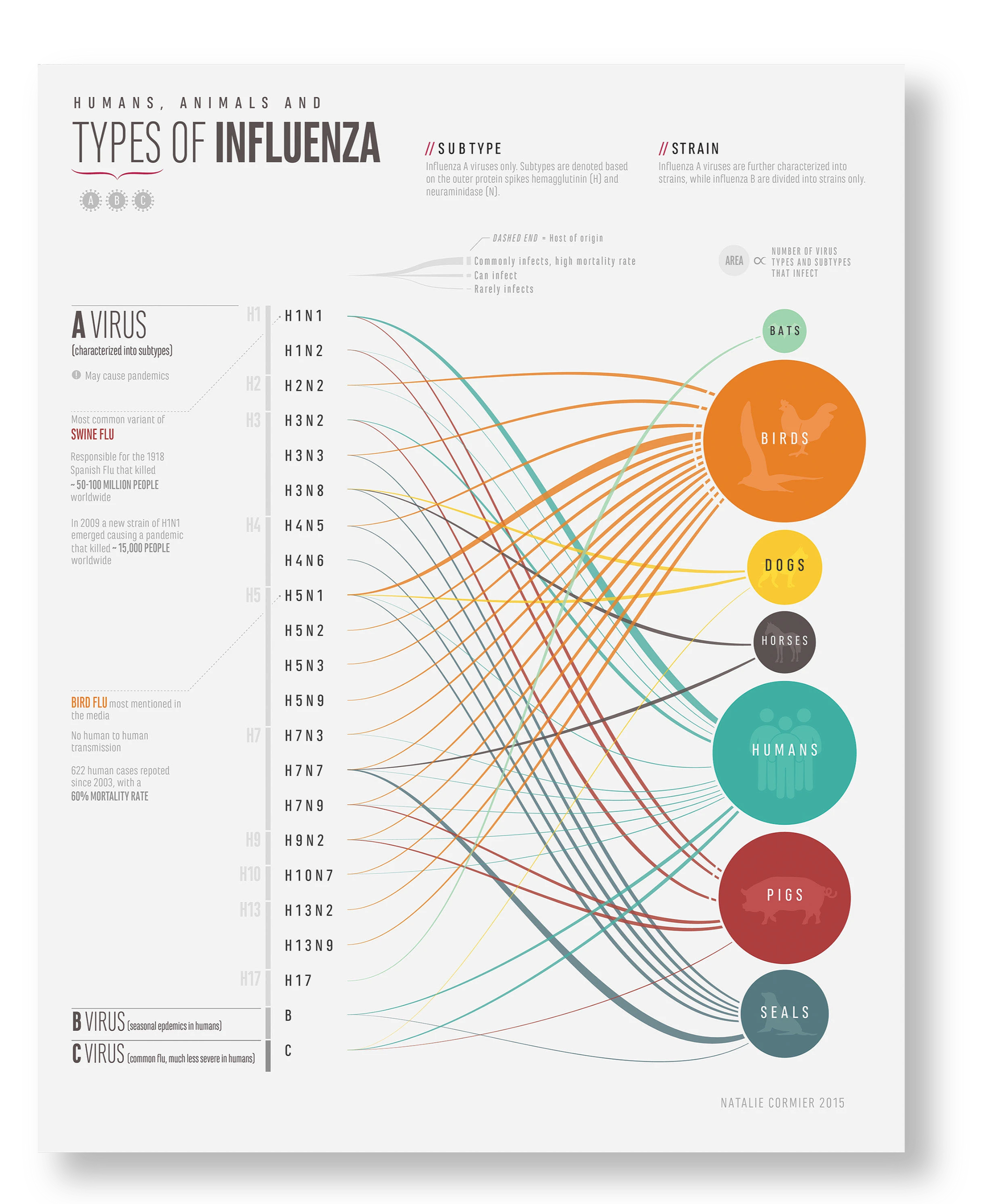
Humans, Animals, and Types of Influenza. 2015, Natalie Cormier.
Satel, S. L. (Ed.). (2009). When altruism isn’t enough: The case for compensating kidney donors. AEI Press.
Scientific Registry of Transplant Recipients. (n.d.). Scientific Registry of Transplant Recipients. https://www.srtr.org/
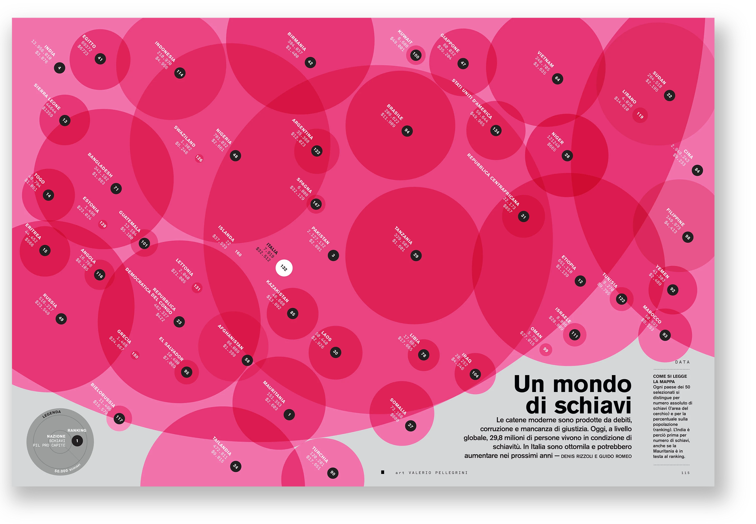
Un Mondo Di Schiavi. 2014, Massimilano Mauro, David Moretti, page 115.
U.S. Department of Health and Human Services. (2025, May). Detailed description of data. OrganDonor.gov. https://www.organdonor.gov/learn/organ-donation-statistics/detailed-description#fig2